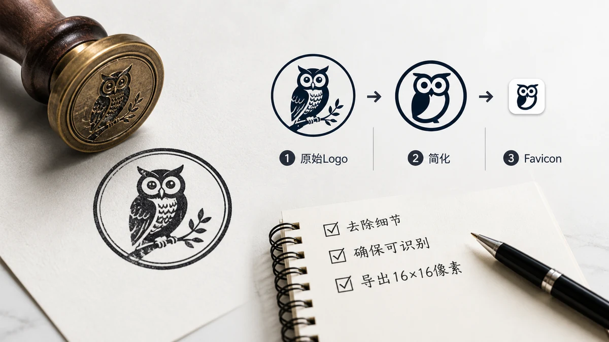
You already have a logo. What you need is that logo turned into the pile of tiny icon files a browser expects — a favicon.ico, a handful of PNGs at specific sizes, a web manifest, and the HTML to wire it all up. That conversion is mechanical, and you can do it in about a minute without installing anything.
The catch is that not every logo shrinks gracefully. So this covers both the quick path and how to fix a logo that turns to mush at 16 pixels.
The short version
- Get your logo as a square image — ideally 512×512 or larger, on a transparent or solid background.
- Drop it into the Favicon Generator.
- Download the generated set and drop the files into your site root.
- Paste the provided HTML snippet into your
<head>.
That's the whole job. The generator outputs favicon.ico, PNGs at 16, 32, 48, 180, 192, and 512, a webmanifest, and the exact <link> tags — so you're not hand-cropping six images or guessing at manifest syntax.
Prep your logo first — this is where quality is won or lost
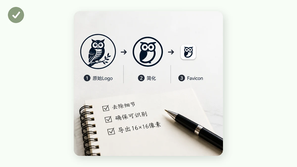
A favicon lives at 16×16 in the browser tab. Whatever detail can't survive that size is wasted. Spend two minutes here and the result looks sharp everywhere.
Make it square. Favicons are square. A wide, horizontal logo will get letterboxed or squished. Crop to the most recognizable element — usually the mark or a single initial — and center it in a square frame.
Drop the wordmark. Your company name in full won't be legible at tab size. "Acme Corporation" becomes a gray smear. Keep the symbol, or a single letter, and let the tab title carry the name.
Check contrast against both themes. Browser tabs come in light and dark. A dark-navy icon vanishes on a dark tab; a pale icon vanishes on a light one. If your mark is one flat color, make sure that color reads on both. A subtle outline or a small solid background chip can help.
Leave breathing room. Add a little padding inside the square so the icon doesn't jam against the edges. It'll look more balanced in every slot.
Start big. A 512×512 (or larger) source gives the generator clean detail to downscale from. Upscaling a tiny logo first just bakes in blur.
Transparent or solid background?
Both work — it depends on the look you want.
- Transparent lets the tab or home-screen background show through. Clean and modern, and it adapts to light/dark surroundings. Best when your mark is a distinct shape.
- Solid background chip (a colored rounded square behind the mark) guarantees the icon reads no matter what's behind it. This is what most app icons do, and it's the safer choice if your logo is thin or low-contrast.
If in doubt, a solid chip in your brand color is the robust option — it never disappears into a matching background.
After you download: where files go
The generator hands you a set of files and a snippet. Two placement rules cover it:
favicon.icogoes at your site root (/favicon.ico). Browsers and Windows look for it there by name even without a<link>tag.- Everything else can live wherever you like as long as the paths in the HTML snippet match. Most people drop them all at the root and paste the snippet as-is.
Then it's just the <head> snippet — icon links, the apple-touch-icon, and the manifest reference. Paste, deploy, hard-refresh, and you should see your logo in the tab.
Why do it in the browser?
Because your logo never leaves your machine. The whole process — reading the image, resizing to every dimension, packing the .ico, writing the manifest — happens locally in your browser using Canvas. Nothing is uploaded to a server, there's no sign-up or watermark, and after your first visit the tool works offline. For a brand asset you may not have published yet, keeping it off third-party servers is the sensible default.
Once your logo is square, high-contrast, and legible small, generating the full set is the easy part.