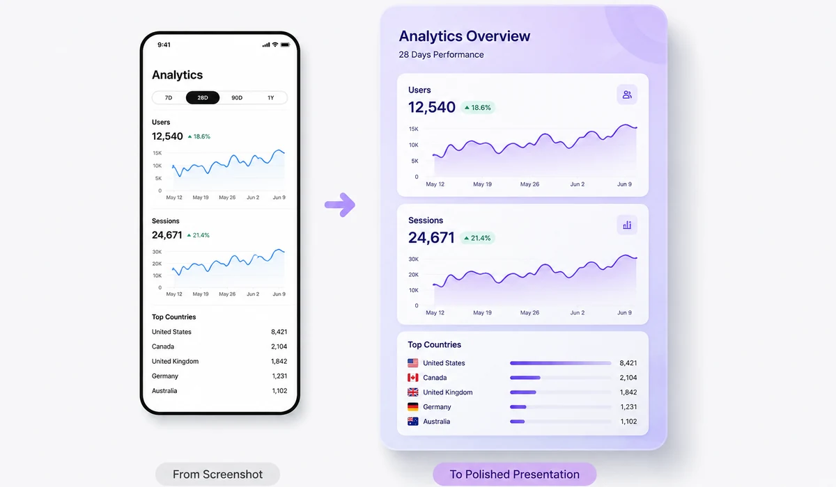
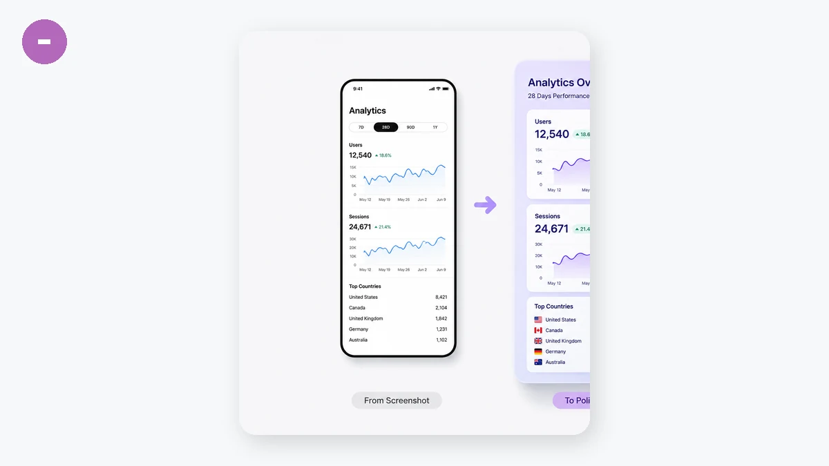
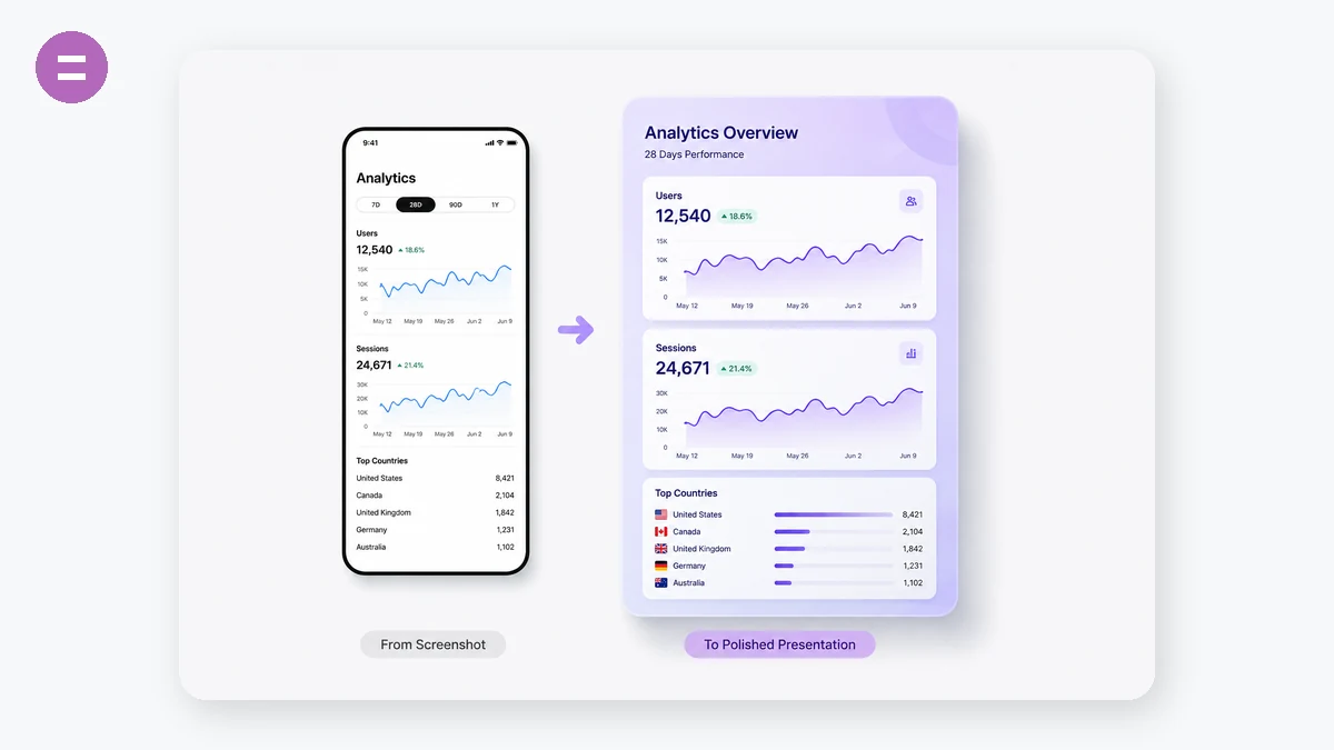
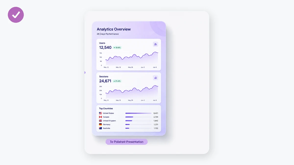
A raw screenshot looks flat pasted into a tweet, a slide, or a landing page. This tool sets it on a nice gradient (or a solid colour), adds breathing-room padding, rounds the corners, and drops a soft shadow underneath — the polished look you see in product screenshots everywhere. Pick an aspect ratio for social or keep it automatic.
Everything composes live on a canvas in your browser and exports as a PNG. Your screenshot — which might show private data — is never uploaded.
How to use
- Add a screenshotDrop in the image you want to dress up.
- Style the framePick a background, padding, corner radius and shadow; choose an aspect ratio if you need one.
- Download PNGSave the polished image, ready for social, docs or slides.
Turn a raw screenshot into a product screenshot
The screenshot beautifier drops your capture onto a background and adds the three things that make a screenshot look designed instead of grabbed: padding around the image, rounded corners on the screenshot itself, and a soft drop shadow that lifts it off the surface. Pick a preset gradient, a solid colour, or a transparent backdrop, adjust each control, and watch the preview update live before exporting a PNG.
It all composes on a canvas in your browser, so the screenshot is never uploaded. That matters because a screenshot can hold a private message, an invoice, a dashboard, or a token in a URL bar — adding a shadow shouldn't mean sending any of that to a server. There's no account, and after the page loads it keeps working offline.
The right shape for wherever it's going
Every place you post an image prefers a shape. Lock the output to 16:9 for slide decks and wide social cards, 1:1 for a square Instagram or LinkedIn post, 3:4 for a tall image that fills more of a phone screen, or leave it on Auto to let the frame wrap the screenshot plus its padding. When you lock a ratio, the padding fills out the rest of the frame so the export drops into the slot without an awkward crop.
Set the background to transparent and the PNG exports with the padding area clear — the padding, corner radius, and shadow all stay, only the fill behind the shadow disappears. That's the version you place onto your own background in Figma, Keynote, or a thumbnail.
What people use it for
Launch and changelog shots — Float a product screenshot on a soft gradient so a release post or changelog looks intentional rather than raw.
Polished tweets and threads — Add padding, rounded corners, and a faint shadow so your screenshot stops colliding with the text around it.
Slide decks — Export at 16:9 with a clean background so screenshots sit consistently across a presentation.
Square social posts — Lock 1:1 so a wide screenshot fits an Instagram or LinkedIn grid without getting cropped.
Figma and Keynote assets — Export on a transparent background to keep the rounded corners and shadow, then drop it onto your own layout.
Documentation headers — Put a screenshot on a solid brand colour for a tidy, on-brand hero image in docs or a wiki.
A bare screenshot looks flat wherever you paste it
A screenshot straight off your screen is a rectangle of pixels with a hard edge on all four sides. On its own that's fine for a bug report. But the moment you drop it into a tweet, a slide, a landing-page hero, or a Notion doc, it looks unfinished — it butts right up against the text around it, the corners feel sharp and cheap, and there's no separation between the image and the background. You've seen the polished version a hundred times: a product screenshot floating on a soft colour gradient, with a bit of breathing room around it, gently rounded corners, and a faint shadow so it lifts off the page. That look isn't a filter or a stock template. It's three small things stacked together, and this tool does exactly those three things.
You drop a screenshot onto the canvas and it composes the finished picture live in your browser. You pick a background — a preset gradient, a solid colour, or transparent — set how much padding sits around the screenshot, choose the corner radius, and dial the drop shadow up or down. The preview updates as you go. When it looks right, you export a PNG. The screenshot, which may hold an email thread, a dashboard, a chat, account numbers, anything, is drawn straight onto a <canvas> element and never leaves the tab. No upload, no account, and once the page has loaded it keeps working with the network off.
What padding, rounding, shadow, and gradient actually do
- Padding gives the screenshot margin so it isn't crammed edge to edge. That gap is what makes it read as a deliberate object placed on a surface rather than a raw capture.
- Rounded corners on the screenshot itself soften the four hard right angles. It's a tiny change that instantly reads as "designed" instead of "grabbed."
- A soft drop shadow separates the screenshot from the background, so it looks like it's sitting slightly above the surface rather than pasted flat onto it. Keep it faint — that's what sells the depth without looking heavy.
- A gradient (or solid) background fills the padding with colour. A gentle two-tone gradient is the single biggest reason those app-launch and changelog screenshots look expensive; a solid colour is the calmer, on-brand alternative.
Together these are the "product screenshot" look, and that's the whole scope of the tool — no more, no less.
Aspect ratios for where it's going
Output can be Auto (the frame just wraps your screenshot plus padding) or locked to 16:9, 4:3, 1:1, or 3:4. The ratio matters because every place you post has a shape it prefers: 16:9 for slide decks and wide social cards, 1:1 for a square Instagram or LinkedIn post, 3:4 for a tall image that fills more of a phone screen. Lock the ratio and the padding fills out the rest of the frame around your screenshot, so the export drops into that slot without getting cropped awkwardly.
Transparent background, on purpose
Set the background to transparent and the PNG exports with the padding area clear instead of coloured. That's the one you want when you're going to place the rounded-corner, shadowed screenshot onto your own background in Figma, Keynote, or a thumbnail — you keep the padding, radius, and shadow, and drop it onto whatever surface you already have. The shadow stays; only the fill behind it disappears.
Why local-only is the point here
Screenshots are quietly one of the most private things you'll ever want to share a version of. A single capture can show a customer's name, an invoice, a private DM, an internal metric, a token in a URL bar. A beautifier that uploads your image to a server to "process" it is asking you to hand all of that over just to add a shadow. Here the compositing is plain canvas work in your own browser, so there's nothing to upload and nothing to trust.
One honest note on scope: this adds the gradient-padding-shadow polish and nothing else. It doesn't wrap your screenshot in a browser chrome or phone-frame mockup, and it doesn't add arrows, blur, or annotations — it's the beautify look, one screenshot at a time.
Why tools.faxianai.com
Gradient or solid
Preset gradients or any solid colour.
Padding & rounding
Breathing room and rounded corners.
Soft shadow
Adjustable depth for a floating look.
Private
Composed locally — never uploaded.