
A good quote wallpaper is mostly restraint. A short line, a calm background, enough empty space that your app icons do not fight the words. The mistake most people make is cramming a long paragraph in a fancy font over a busy photo, and then it is unreadable at a glance. The fix is to keep it minimal. Here is how.
Pick a line that actually fits a screen
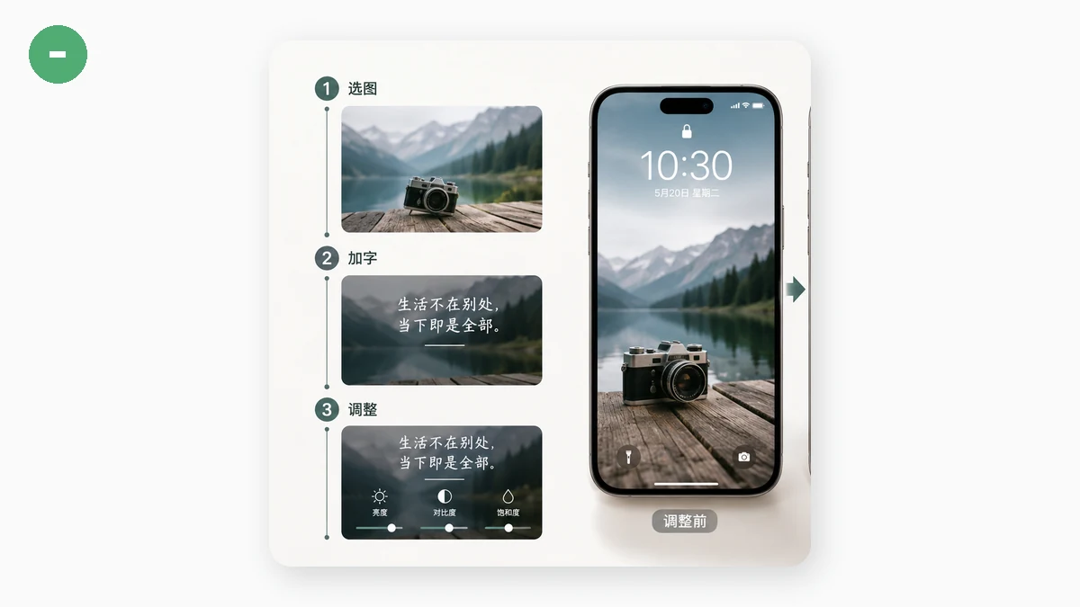
Screens are read in a second, not studied. The quotes that work are short — usually under ten words. "Do the work." "One thing at a time." "Rest is not quitting." A four-word line at large size looks confident. A forty-word paragraph shrinks to unreadable and clutters the home screen.
If your quote is long, cut it to its core clause. You are making a wallpaper, not a poster you will stand and read.
Match the size to the device first
Set the canvas to your device's resolution before you touch the text, so nothing gets stretched later. Common targets:
| Device | Wallpaper size | Orientation |
|---|---|---|
| iPhone (recent) | 1290 × 2796 | Portrait |
| Android phone | 1080 × 2400 | Portrait |
| iPad | 2048 × 2732 | Portrait |
| Desktop 1080p | 1920 × 1080 | Landscape |
| Desktop 1440p | 2560 × 1440 | Landscape |
Phone wallpapers are tall and portrait; desktop ones are wide and landscape. A line that looks balanced on a phone will float awkwardly on a monitor, so decide the device first and design for that shape.
Keep the background quiet
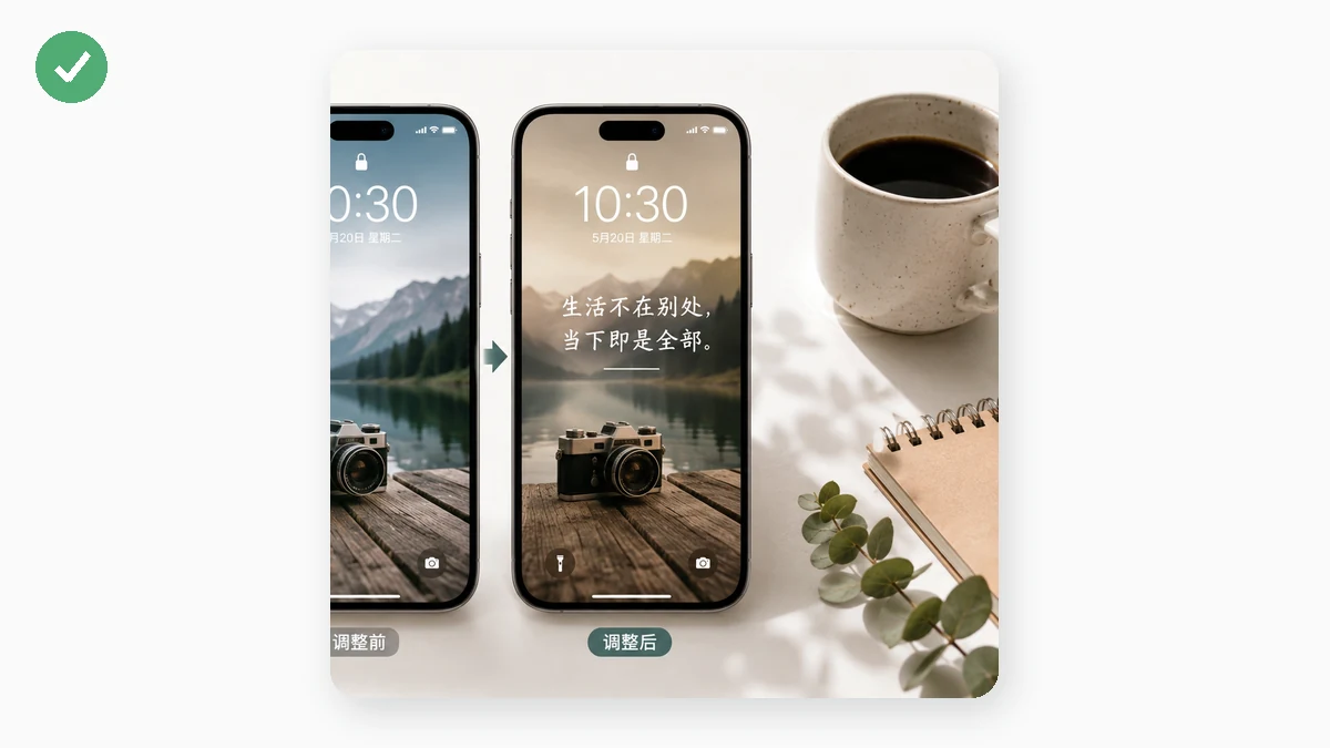
A solid color or a soft gradient beats a photo for readability. Dark text on a light gradient, or light text on a deep one, stays legible while icons sit on top. If you must use a photo, it needs a dark overlay or a heavily blurred area behind the words, or the text disappears into the busy parts.
Contrast is the whole game. Before you export, squint at it — if the words are hard to read squinting, they will be hard to read on your lock screen too.
Build it
The Wallpaper Maker is built for exactly this: type your words, pick a gradient background, choose a device size, and export. It leans minimalist on purpose — gradient plus text, sized for phones, tablets, or desktops — so you get a clean result without fiddling with a full design tool. It runs entirely in your browser, nothing uploads, and there is no watermark on the export.
A quick recipe
- Choose a short line — cut it until it stings.
- Set the canvas to your exact device size.
- Pick a gradient with enough contrast for the text.
- Center the words, leave generous margins, keep the lower third clearer where phone clocks and icons live.
- Export and set it.
Want a matching set? Make the same quote in your phone size and your desktop size so your devices feel consistent. Because it all runs in the browser and works offline after the first visit, you can redo it any time the line stops resonating — no account, no cost.