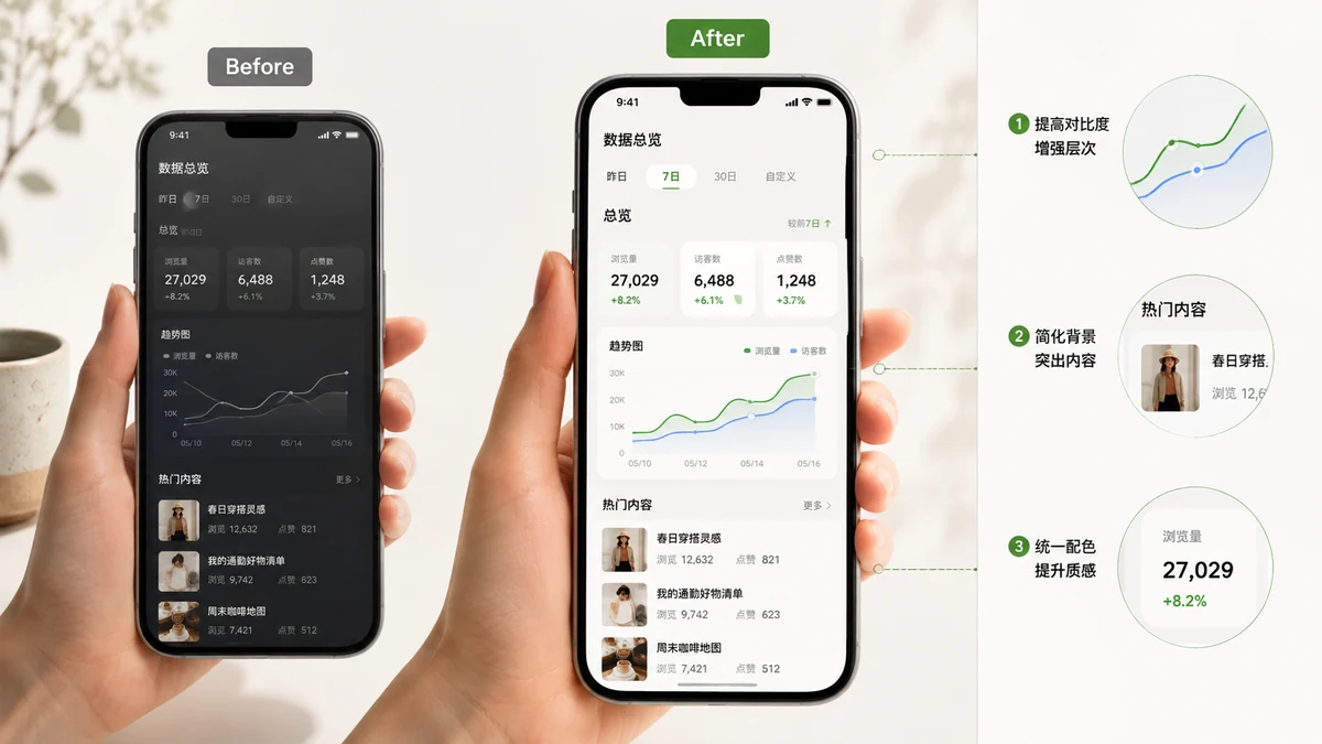
You built something, or you spotted a great feature, and you want to show it off. So you take a screenshot, drop it into a tweet, and it just sits there — a flat grey rectangle with hard corners, jammed against your text. Next to a polished post it reads as an afterthought. The good news is that the difference between "raw capture" and "product screenshot" is not skill or an expensive tool. It's three small adjustments and picking the right shape for the platform.
Why the raw screenshot looks flat
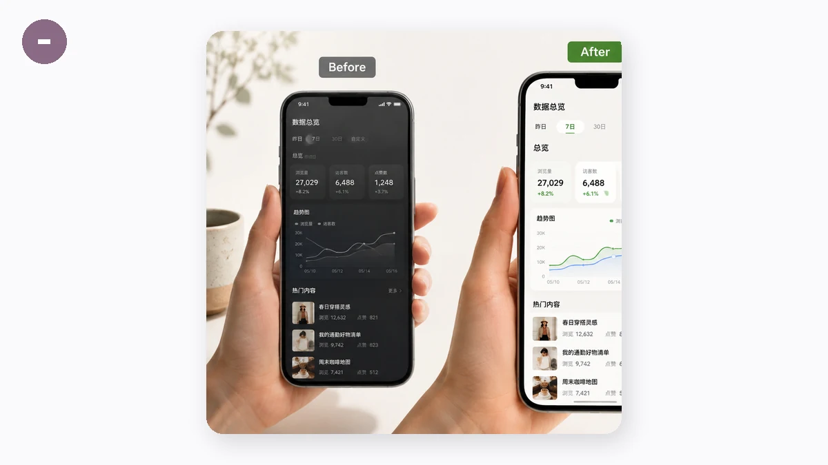
A screenshot has a hard edge on all four sides and no relationship to whatever it lands on. In a feed, it collides with the background of the post and the text around it. There's no margin, so nothing tells the eye "this is a self-contained thing"; there's no depth, so it looks pasted rather than placed. The polished screenshots you scroll past every day have quietly fixed exactly those two problems.
The three-part recipe
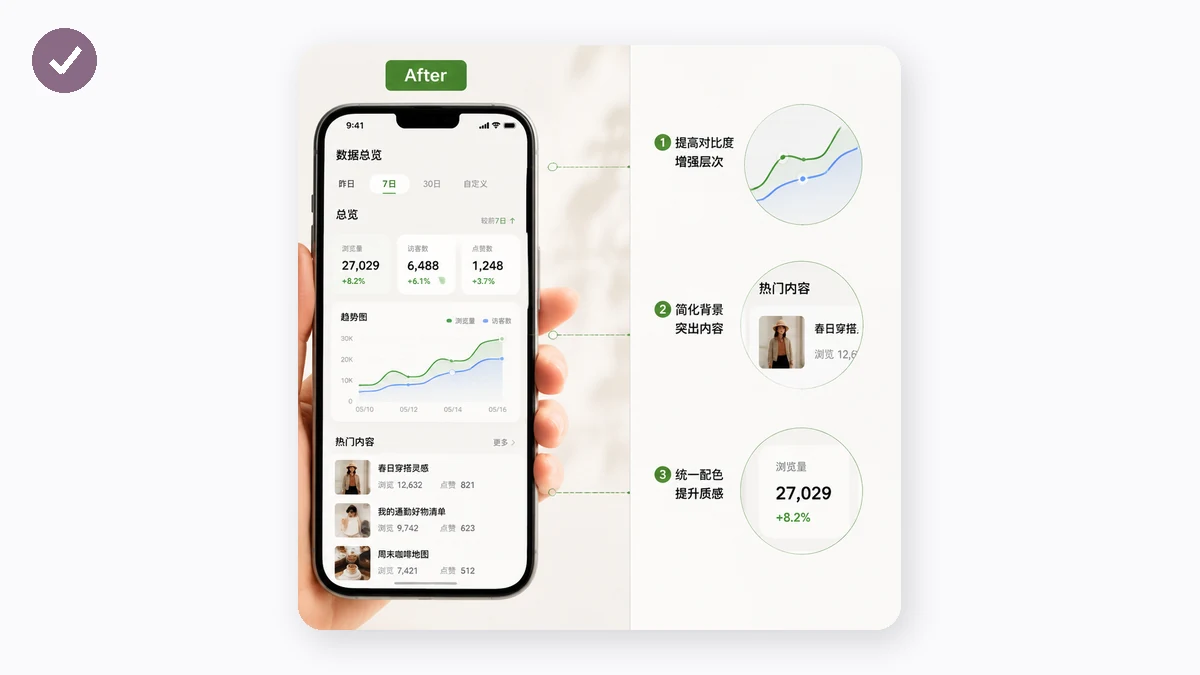
Every "how did they make it look so clean" screenshot is doing the same three things:
- Padding — a band of space around the screenshot so it isn't crammed edge to edge. This alone does most of the work.
- Rounded corners — softening the four sharp right angles on the screenshot itself, which instantly reads as designed.
- A soft shadow plus a background — a faint drop shadow lifts the image off the surface, and a gentle gradient (or a solid brand colour) fills the padding so the whole thing looks intentional.
That's the entire "product screenshot" look. You don't need a device frame or annotations for it to work — those are a different job.
Drop your screenshot in, pick a gradient or solid background, nudge the padding and corner radius, and set the shadow to taste. The preview updates live, and you export a PNG when it looks right. It all composes on a canvas in your browser, so the screenshot — which might show a DM, a dashboard, or an email — is never uploaded anywhere.
Pick the aspect ratio for the platform
The same beautified image should be a different shape depending on where it's going, and the tool locks the output to Auto, 16:9, 4:3, 1:1, or 3:4:
- 16:9 — wide social cards and slide decks. Fills a landscape slot cleanly.
- 1:1 — a square post for Instagram or LinkedIn, where tall or wide images get cropped in the grid.
- 3:4 — a tall image that takes up more of a phone screen as someone scrolls.
- Auto — when you just want the frame to wrap the screenshot plus its padding, with no forced shape.
Lock the ratio you need and the padding fills out the rest of the frame around your screenshot, so the export drops into the slot without an awkward crop.
A few taste notes
Keep the shadow faint. A heavy shadow looks like a bad drop-shadow from 2009; a light one just adds depth. Don't over-round the corners — a small radius reads as polished, a huge one starts to look like a bubble. And match the background to the mood: a calm solid colour for something serious, a soft gradient when you want it to feel like a launch.
The takeaway
You don't need design software to make a screenshot look like it belongs in a real post. Add margin, round the corners a little, float it on a soft background with a faint shadow, and export at the shape the platform wants. It takes under a minute, nothing leaves your browser, and the result stops looking like a raw capture and starts looking like something you meant to share.