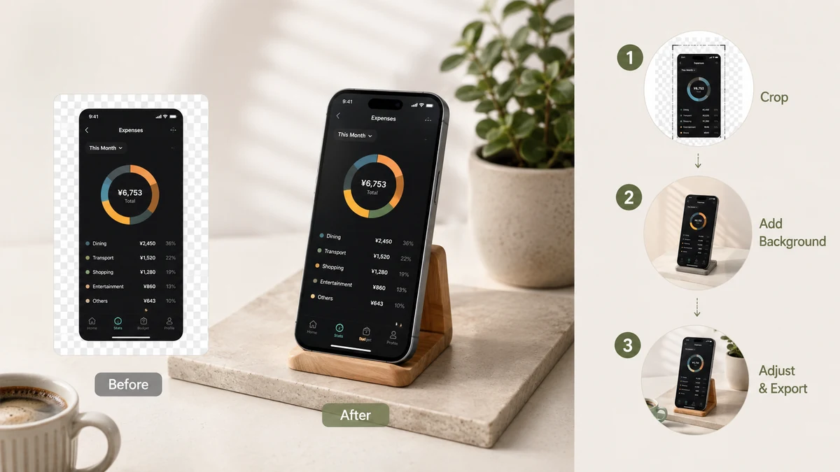
Putting a background behind a screenshot is the fastest way to make it look finished. The screenshot stops being a bare rectangle and becomes an object sitting on a surface — with a margin around it, softened corners, and a bit of depth. This guide covers the three background options (gradient, solid, transparent), when to reach for each, and how to get there without handing your screenshot to a server.
Why a background changes everything
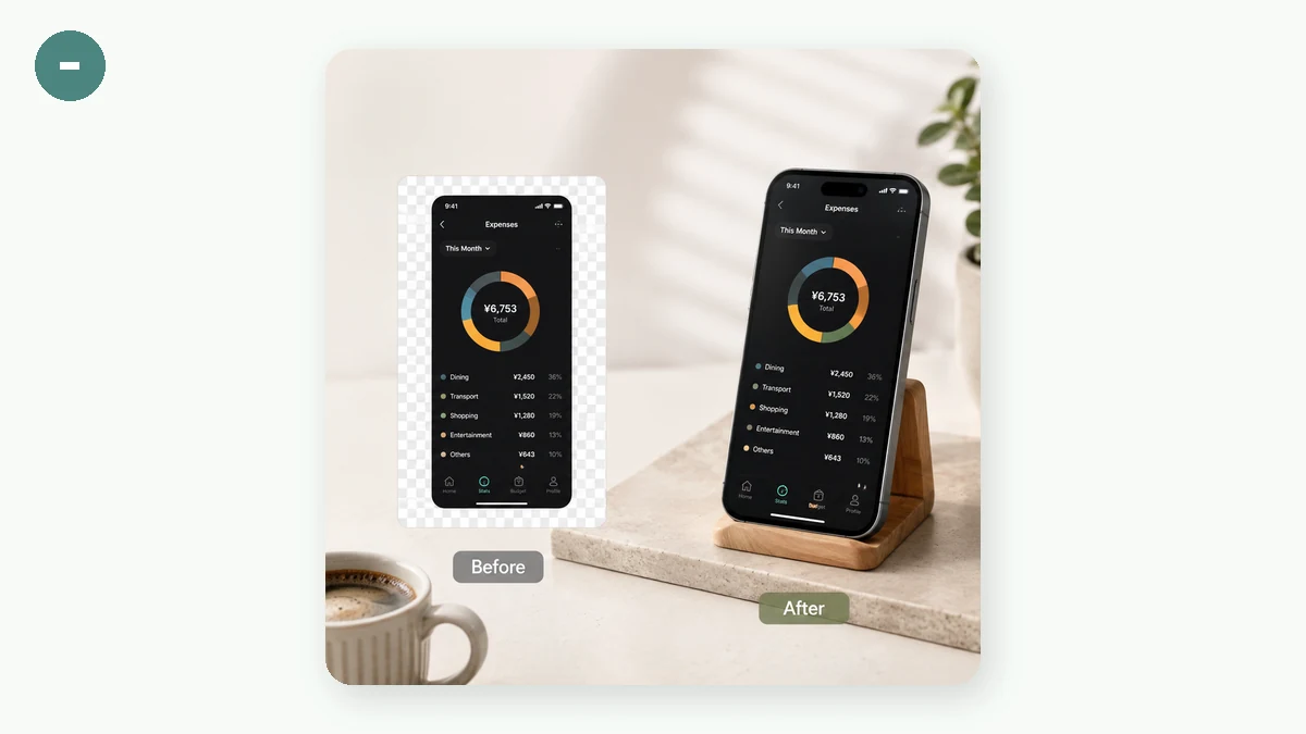
A raw screenshot has no margin and no separation from whatever it lands on. Add a background and you get padding — the band of colour around the screenshot — which immediately reads as intentional. Round the screenshot's corners and drop a faint shadow behind it, and it lifts off that background instead of lying flat. Those are the pieces working together: the background is the canvas, the padding is the breathing room, the shadow is the depth.
Gradient background
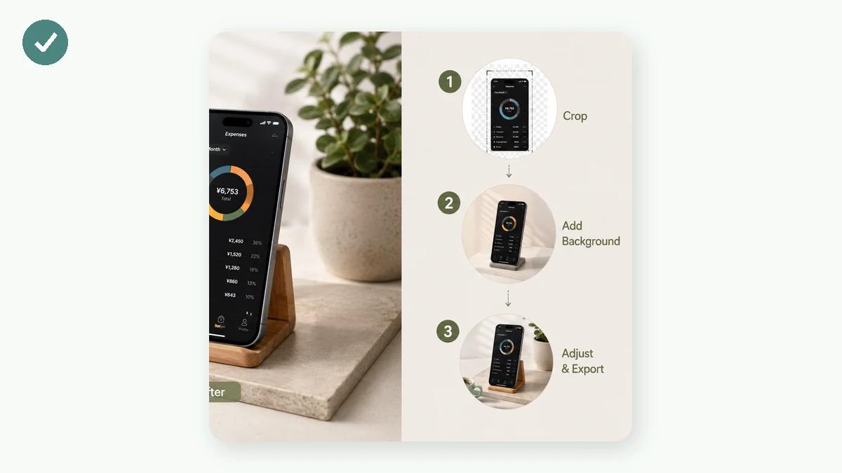
A gentle two-tone gradient is the reason app-launch and changelog screenshots look expensive. It fills the padding with a soft wash of colour that draws the eye to the screenshot without competing with it. Reach for a gradient when you want the image to feel like a release announcement or a hero shot — something with a bit of energy.
Drop your screenshot onto the canvas, pick one of the preset gradients, and adjust the padding until the colour band feels balanced. The preview updates live, so you can see the whole composition — screenshot, corners, shadow, background — before you export a PNG.
Solid colour background
A solid colour is the calmer, on-brand choice. When you have a brand colour and you want the screenshot to sit inside it cleanly, a flat fill keeps the focus entirely on the screenshot and reads as deliberate rather than flashy. It's the safe pick for documentation, a serious announcement, or a set of images that need to look consistent with each other.
Transparent background
Set the background to transparent and the PNG exports with the padding area clear instead of filled. This is the one you want when you're not finishing the image here — you're taking the rounded-corner, shadowed screenshot into Figma, Keynote, a thumbnail, or your own layout, and dropping it onto a background you already have. You keep the padding, the corner radius, and the shadow; only the fill behind the shadow disappears. It's the most flexible option because it hands the final surface back to you.
Padding, corners, and shadow
Whichever background you pick, three controls shape the result:
- Padding decides how much colour sits around the screenshot. More padding makes the screenshot feel smaller and more deliberate; less keeps it close and dense.
- Rounded corners on the screenshot soften its hard edges. A small radius reads as polished; keep it subtle.
- A soft shadow separates the screenshot from the background. Keep it faint so it adds depth without looking heavy.
You can also lock the output to a set aspect ratio — Auto, 16:9, 4:3, 1:1, or 3:4 — and the padding fills out the frame to match, so the export fits wherever it's going.
It all stays on your machine
The compositing happens on a canvas in your browser, so the screenshot is never uploaded. That matters more than it sounds: a screenshot can hold a private message, an invoice, a dashboard, or a token in a URL. Adding a background shouldn't mean sending any of that to a server, and here it doesn't — there's no upload, no account, and after the page loads it works offline.
One honest note: this adds the gradient-padding-shadow look and nothing else. It won't wrap your screenshot in a browser or phone-frame mockup and it doesn't add arrows or annotations. For a clean background behind a single screenshot, that's exactly the job.