
You see a color you want to reuse — in a photo, a screenshot of a site you like, an old logo whose source files are long gone — and you need the actual hex code, not a guess. Eyeballing it never quite works; monitors lie and "that blue" is really six slightly different blues. Pulling the palette straight from the pixels gives you codes you can paste into CSS, a design tool, or a brand doc.
Here's how to do it, and how to get a palette that's actually usable rather than a random grab of pixels.
What "extracting a palette" actually does
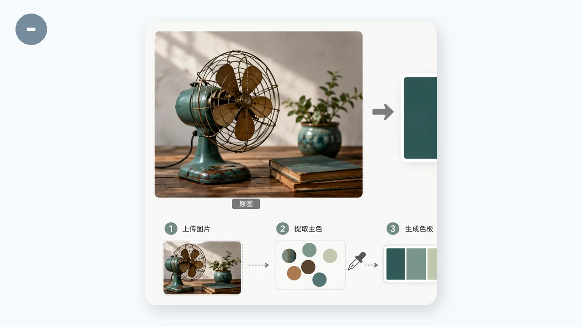
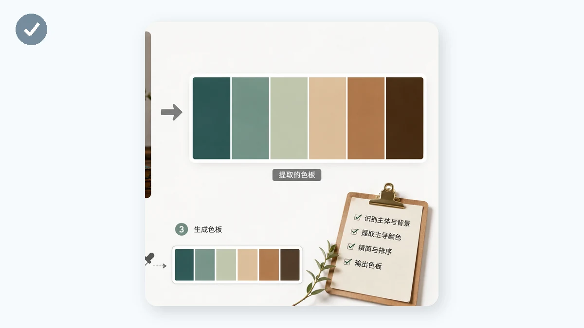
The tool scans the image and finds the colors that best represent it — the dominant tones plus the notable accents — then gives you each one as a hex code you can copy. Instead of a million individual pixel colors, you get a tidy set (say 5 or 8) that summarizes the image.
This is genuinely useful for a few common jobs:
- Recovering brand colors from a logo or old asset when you don't have the original spec.
- Building a design palette from a photo whose mood you want to match — a landscape, a product shot, a piece of art.
- Matching an existing site or graphic you've only got a screenshot of.
- Picking a background or accent that harmonizes with an image you're already using.
Drop an image in and read the codes off:
Use the count control to get a useful palette
The single most important setting is how many colors you pull. It changes the answer completely.
- Fewer colors (3–5) give you the essential palette — the handful of tones that define the image. This is what you usually want for branding or a design system, where a tight set is a feature, not a limitation.
- More colors (8–12) capture subtle accents and gradients. Useful when an image is rich and varied and you want the secondary tones too, or when you're studying exactly how a photo is composed.
If the first result feels off — one shade dominates, or an accent you wanted got merged away — adjust the count and re-read. A photo that's 80% sky will hand you a lot of blue at low counts; bump the count up to surface the smaller pops of color.
Click to copy — the workflow that matters
Reading a hex code and typing it out is where errors creep in (#3A7BD5 vs #3A7BD6 and you've spent ten minutes wondering why it looks wrong). In the Color Palette tool, each swatch copies its hex code on click, so you go straight from image to clipboard to your stylesheet without touching the keyboard.
A practical flow:
- Load the image.
- Set the count to match the job — low for a brand palette, higher to catch accents.
- Click each swatch you want; paste it where it's going.
- Not enough range? Nudge the count and grab the extras.
Reading the results with a designer's eye
A few things worth knowing so the palette lands well:
- The dominant color isn't always the useful one. A product photo on a white background will report a lot of white or near-white. That's accurate, but the color you actually care about is the product — take the count higher to pull it out, or crop to the subject first.
- Photos have more colors than they look like. Skin, shadows, and reflections add tones you didn't consciously notice. A higher count reveals them; a lower count hides them behind the averages.
- Hex is portable. Every code you copy works directly in CSS, Figma, Photoshop, Canva, or a brand doc. No conversion needed.
Why it stays in your browser
The whole extraction runs locally — the image is read and analyzed in your browser with Canvas, and it's never uploaded to a server. That matters when the "image" is an unreleased mockup, a client's private brand asset, or an internal screenshot you shouldn't be posting to a random web tool. It's free, needs no sign-up, and after your first visit it works offline.
Grab the colors, click to copy, paste them where they belong.