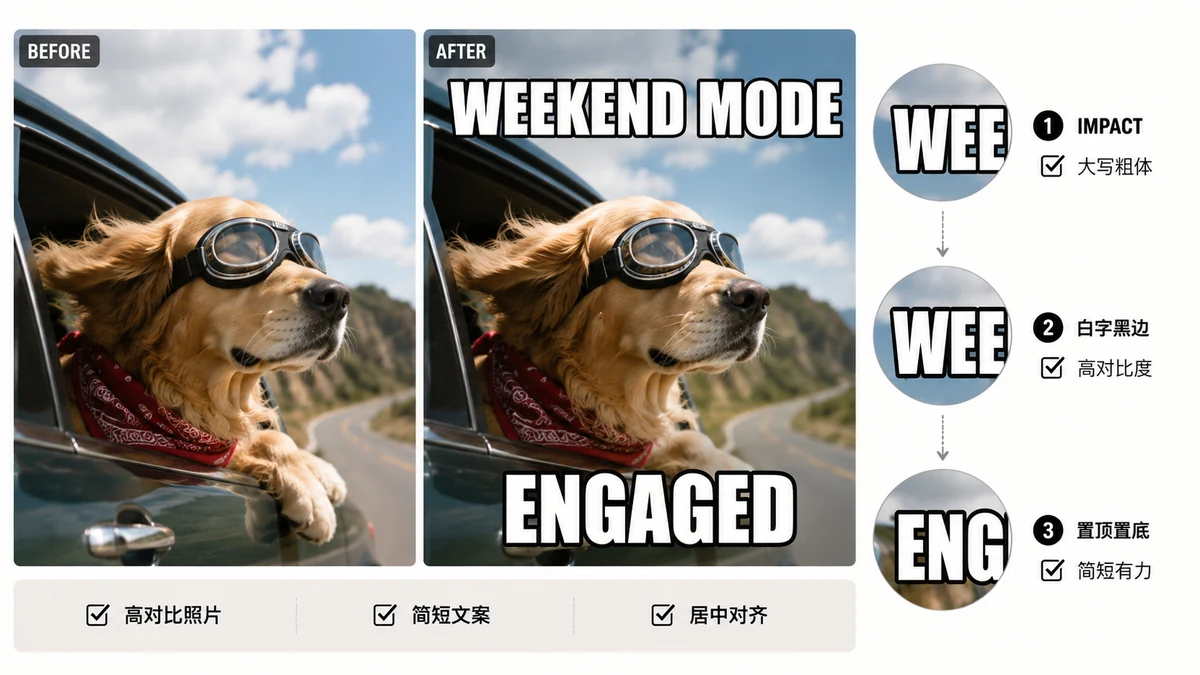
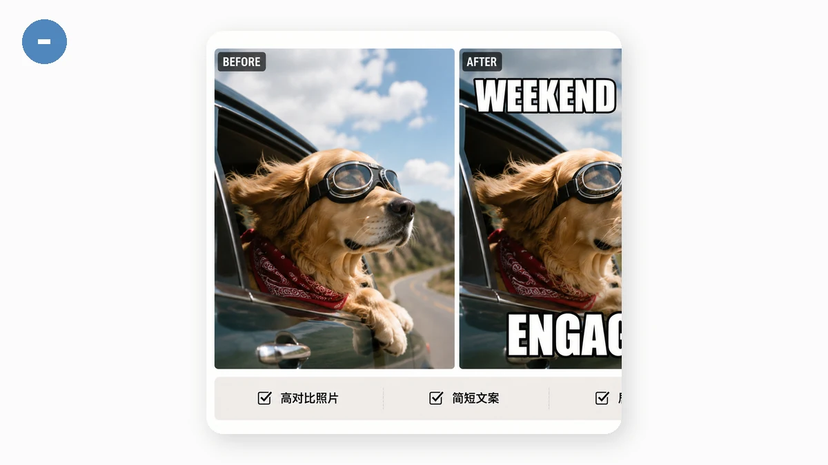
Look at almost any classic meme and the text is the same: bold, condensed, white, outlined in black, usually shouting in all-caps across the top and bottom. That's not a coincidence and it's not laziness. Each of those choices solves a real problem, and once you see why, you'll caption images better — even when you're not making a joke.
Why Impact specifically
Impact is a heavy, narrow sans-serif from the 1960s that shipped with Windows for decades, which means for a long stretch of internet history it was one font almost everyone already had installed. That's most of the story: memes spread on ubiquity, and Impact was the boldest face guaranteed to be on the viewer's machine.
But it also happens to be well-suited to the job. It's condensed, so a long caption fits across an image without shrinking to nothing. It's heavy, so it holds up over a busy photo instead of getting lost in the detail. A lighter or wider font would need more room and more contrast to read as clearly. Impact packs a loud line into a small strip of pixels — exactly what a caption needs.
Why white fill with a black outline
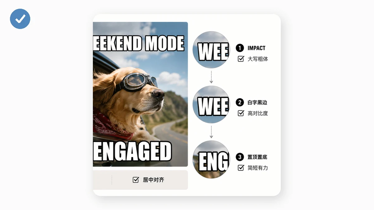
This is the part that does the real work. A caption has to sit on top of an image you don't control — it might land on a bright sky, a dark shadow, or a chaotic pattern, sometimes all three within the same line. White text alone vanishes on light areas. Black text alone vanishes on dark ones. White fill with a black outline never vanishes on either: the black edge separates the letters from whatever's behind them, and the white core stays bright. It's the same reason subtitles and sports scores use an outline. You get legibility over any background for free, without having to think about it.
That's exactly what this tool draws by default — bold Impact-style text (with a system fallback if Impact isn't installed), white fill, black outline, auto-wrapped and centred:
Why all-caps
The UPPERCASE toggle isn't just for the shouty tone, though that's part of it. Capital letters have simpler, more uniform shapes than lowercase — no descenders dipping below the line, more consistent height — so they read cleanly at small sizes and over noisy backgrounds. All-caps also fills the caption strip more evenly, which suits the top-and-bottom layout. Flip it off when you want a calmer, more normal look; flip it on for the traditional meme voice.
Readability tips
- Keep lines short. The format rewards punchy. If a caption wraps to three lines it starts crowding the image — say it in fewer words. The tool wraps and centres automatically, but shorter still reads better.
- Match the outline to the image, not just habit. Black outline on white text is the default and works almost everywhere. But over a very dark, low-contrast image you can bump the text size up so the outline reads, or adjust the colours if the scene fights the default.
- Size for where it'll be seen. A caption that's comfortable on your monitor can be tiny in a phone feed. Err larger — the whole point is that someone reads it at a glance while scrolling.
- Let the top and bottom carry different beats. The classic setup is a setup on top and a punchline on the bottom. Two short lines with a gap of image between them reads better than one long line crammed anywhere.
None of this requires design skill. The style is a solved problem — Impact, white, black outline, big, often all-caps. Pick your image, type two short lines, and the format does the heavy lifting.