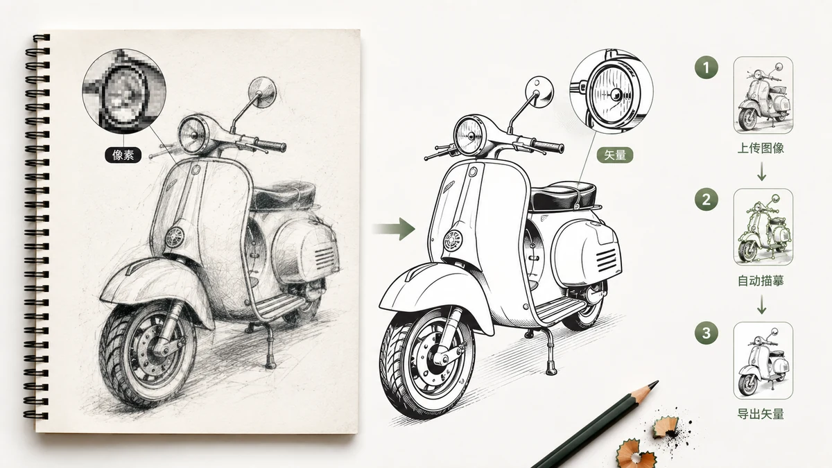
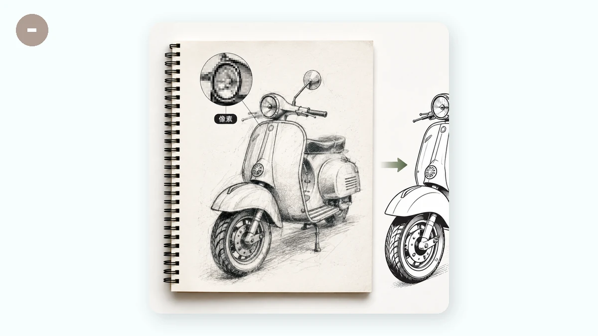
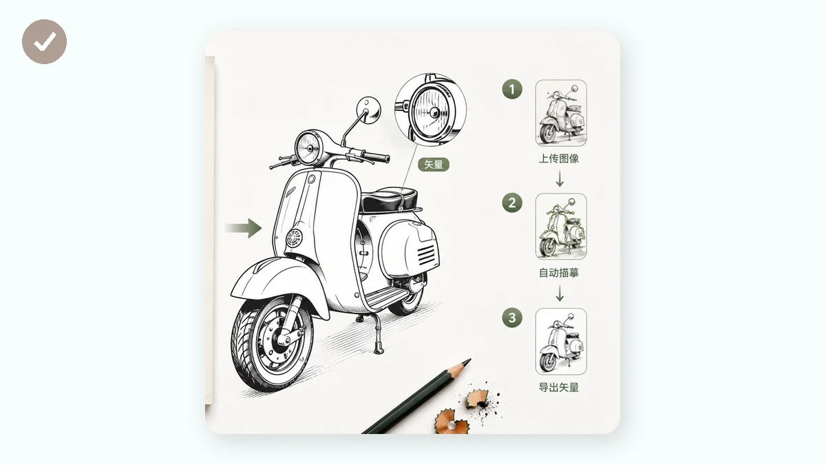
Raster and vector are two different ways of storing an image, and knowing the difference tells you exactly when to convert between them. A raster image — PNG, JPG, WebP — is a fixed grid of coloured pixels. A vector image — SVG — is a set of instructions: draw this path, fill it with this colour, put this circle here. Because a vector describes shapes with math instead of pixels, it stays sharp at any size, while a raster blurs the moment you push it past its native resolution.
"Raster to vector" means tracing: an engine reads the pixels and works out the shapes hiding in them, then writes those shapes out as vector paths. Done in the right situation it's genuinely useful. Done in the wrong one it makes a mess. This guide covers both.
What tracing is good for
Tracing wants flat, clean-edged input: logos, icons, simple illustrations, line art, hand lettering. These have a limited palette and clear boundaries, so the tracer can find each region of colour and draw a tidy path around it. The result is a compact SVG with a handful of shapes — sharp at any scale, small in file size, and editable afterward. If your goal is a logo that works from favicon to billboard, tracing gets you there.
Why photos are the wrong fit
A photograph is the opposite of what a tracer wants. It has thousands of subtly varying colours and no hard edges — continuous tone. To vectorize that, the engine has to approximate every gradient with stacked, overlapping blobs of flat colour. Three things go wrong at once: the SVG becomes enormous, often several times larger than the original JPG; it looks smeared and posterized instead of photographic; and it's painful to edit because it's made of thousands of meaningless shapes. For photos, a raster format is simply the right answer — compress the JPG or convert to WebP instead. Vector is for graphics, not photographs.
Presets and colour count
The number of colours the tracer is allowed to use is the biggest lever on the result. Presets set that for you: Flat / logo keeps colours low for simple marks, Detailed allows more for richer illustrations, Posterized collapses the image into bold flat bands, and Black & white reduces everything to two tones for line art and silhouettes. Fewer colours mean a cleaner, smaller file; more colours capture subtlety at the cost of extra paths and weight. Trying two presets on the same image and comparing the before/after preview is the fastest way to find the right balance.
All local, nothing uploaded
The whole conversion runs in your browser with the imagetracer engine. The image is read from a canvas on your own machine, traced there, and handed back as an SVG — nothing is uploaded, there's no account, and once the page has loaded it works with the network switched off. That's worth having for a logo or an internal graphic you'd rather not send to someone else's server.
One clarification, because the word "convert" invites it: this is real tracing, not an AI redraw. It follows the pixels you gave it and doesn't invent a cleaner version of your artwork. A crisp, flat, few-colour source gives a crisp result; a blurry or noisy one gives blurry, noisy paths.
After the trace
Because the output is a standard SVG of named paths and fills, you can keep working on it in any vector editor — Illustrator, Inkscape, Figma. Recolour a whole region by editing one fill, set precise brand colours, remove stray shapes, or adjust a path. That's the point of going vector: the image stops being a fixed picture and becomes an object you own and can reshape at any size, blur-free.