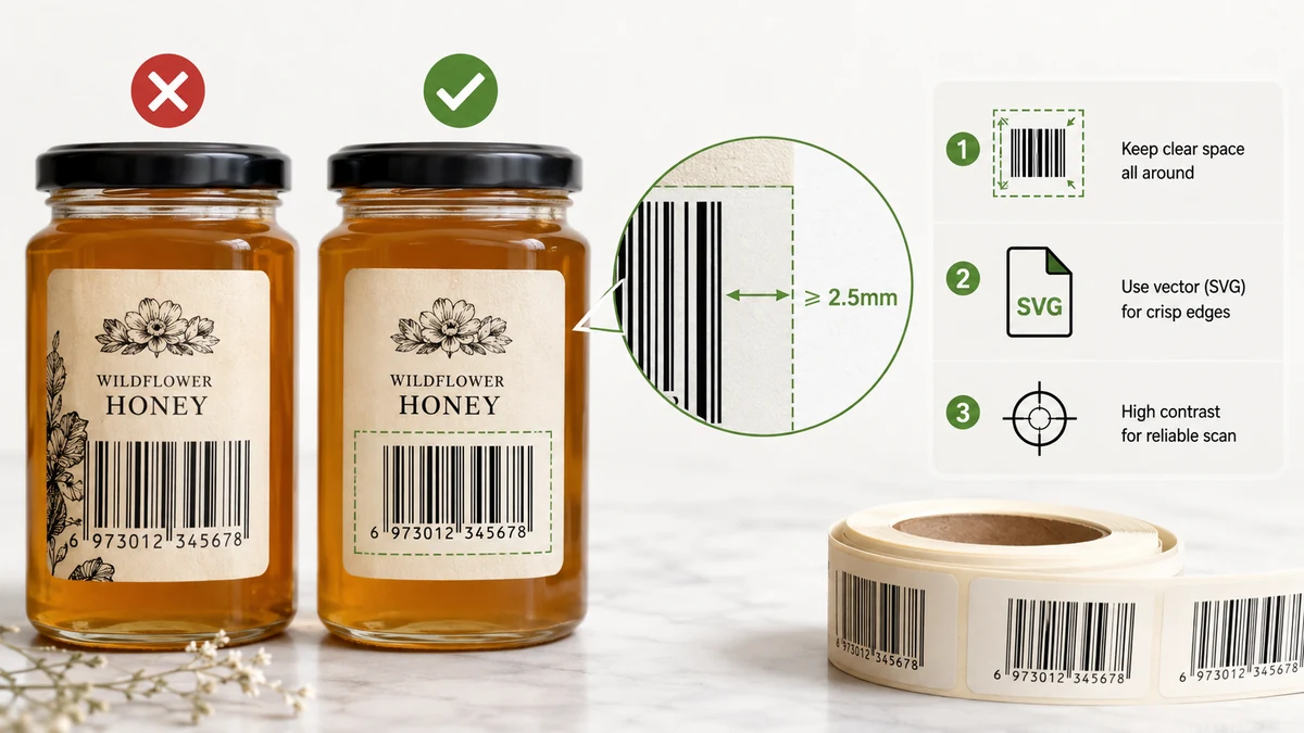
The most frustrating way to learn about barcode printing is at the loading dock, when a scanner beeps in refusal on a code you generated an hour ago. It looked perfect on screen. On paper it's a smear the reader won't touch. Print is less forgiving than a screen, and a handful of small things decide whether your code reads on the first pass or wastes everyone's time.
Export SVG for anything you'll print
If a barcode is headed for a printer, export it as SVG, not PNG. SVG is a vector format: the bars are described as shapes, not pixels, so they stay perfectly crisp at any size and any printer resolution. Drop an SVG into a label template, a packaging layout, or a sheet of sticker labels and every bar edge prints sharp.
A PNG, by contrast, is a fixed grid of pixels. Scale it up for a larger label and the once-clean edges turn soft and stair-stepped — exactly the blur that makes narrow bars run together and scanners give up. PNG is fine for a quick preview or an on-screen mockup. For the printed article, reach for SVG.
Give it a quiet zone
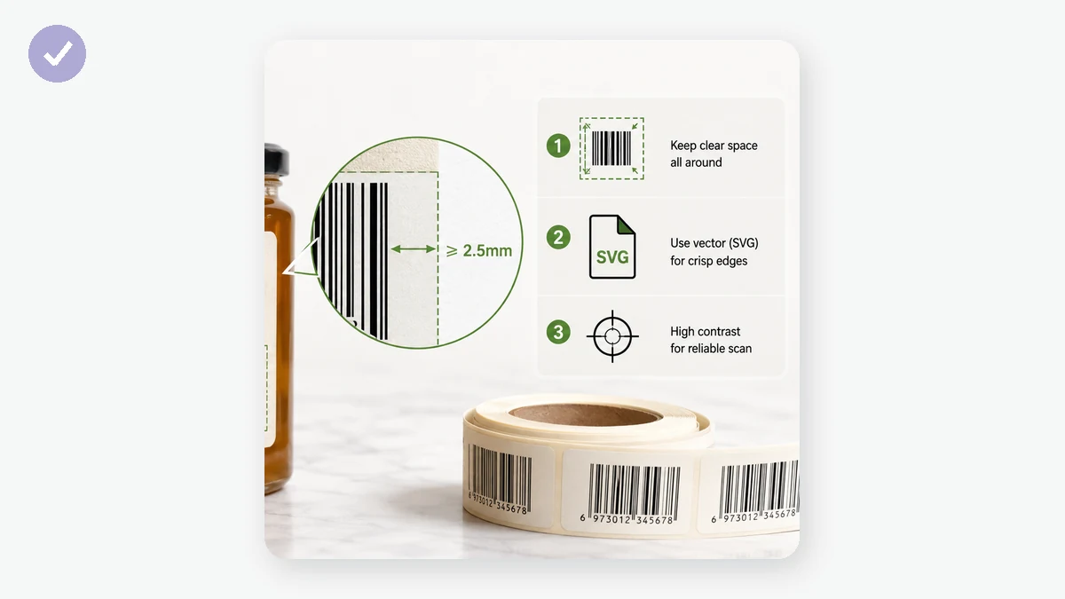
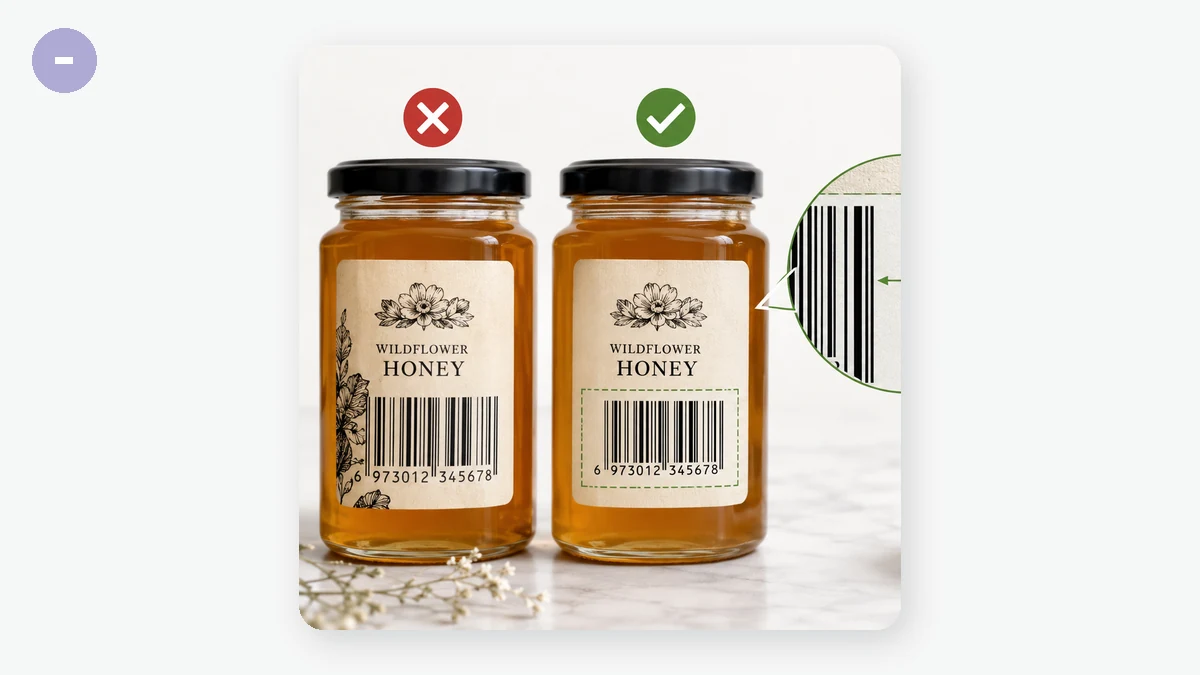
This is the single most common reason a printed barcode won't scan, and it isn't a setting you toggle — it's empty space. The quiet zone is the blank margin to the left and right of the bars. A scanner uses that clear area to find where the code begins and ends; without it, the reader can't lock on.
So when you place a barcode in a design, don't crop tight against the outermost bars, and don't butt it up against a border, text, or a busy background. Leave a comfortable band of plain background on both sides — a rough rule of thumb is at least the width of about ten of the narrowest bars. When in doubt, give it more room, not less.
Size and bar width
Two things control how "thick" your code is. Bar width — the module width — is the thickness of the narrowest bar. Set it too thin and a printer can't lay down clean lines; ink spreads, toner scatters, and adjacent bars blur into each other. If a code fails, widening the bars a little is often the fix. Bar height just needs to be tall enough that a scanner can sweep a clean line across the bars, even at a slight angle.
Don't shrink a barcode to fit a cramped label. A code that's physically too small pushes the narrowest bar below what your printer can render cleanly. It's better to give the barcode the space it needs than to squeeze it and hope.
Contrast: dark bars, light background
Scanners read barcodes by the difference between dark bars and light gaps, so contrast is everything. The safe choice is black bars on a white background. This tool lets you set foreground and background colours, which is handy for matching a design — but light-coloured bars, a dark background, or a low-contrast pairing (say navy bars on a grey box) are a leading cause of failed scans. Red is also risky: many red-laser scanners struggle to see red bars at all. If in doubt, keep it black on white.
Keep the text caption
Leave the human-readable text under the bars turned on unless you have a specific reason not to. When a scan fails — smudged label, bad angle, worn sticker — a person can read the number and key it in by hand. That little line of text is your fallback, and it costs you nothing.
A quick pre-print checklist
- Exported as SVG for the printer.
- A generous quiet zone on both sides, nothing crowding the bars.
- Bar width not too thin for your printer; barcode not shrunk to fit.
- Black bars on a white background, or at least strong contrast.
- Human-readable text caption left on.
- Printed a test copy and scanned it with the actual device you'll use in production — the only test that truly counts.