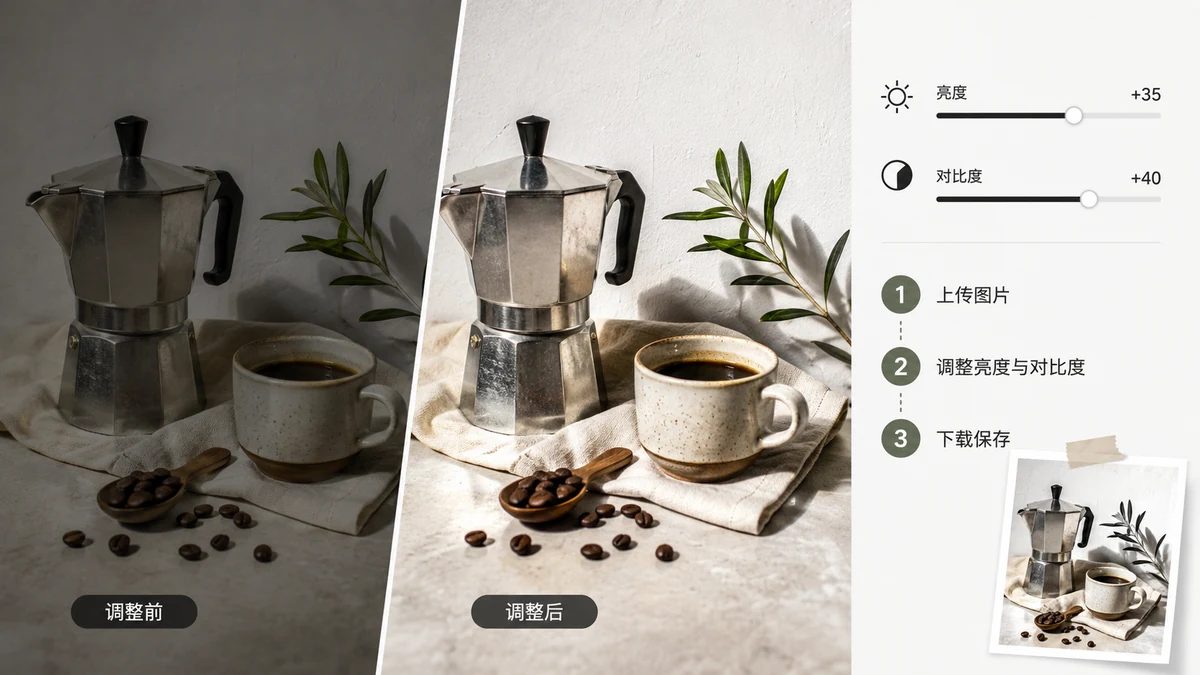
Most photos that look "off" are fixable with two sliders. Underexposed and murky? Brightness. Flat and gray, with no depth? Contrast. Once you can tell those two problems apart, you can rescue a surprising number of shots in about ten seconds — no editing skills, no software to install.
Brightness vs contrast: what each one actually changes

They're easy to confuse, so here's the plain version.
Brightness moves the whole image lighter or darker, evenly. Turn it up and everything — shadows, midtones, highlights — lifts together. Use it when the photo is simply too dark or too light overall: a shot taken in a dim room, a face lost in shadow, a scan that came out gray.
Contrast stretches the gap between dark and light. Turn it up and the darks get darker while the lights get lighter, which adds depth and "pop." Turn it down and everything drifts toward middle gray, going soft and flat. Use contrast when a photo looks washed-out and lifeless even though the exposure is roughly fine.
The trap is reaching for brightness when the real problem is contrast. A flat photo isn't too dark — brightening it just makes it a paler flat photo. It needs contrast to separate the tones. Diagnose first, then move the right slider.
A quick routine that works on most photos
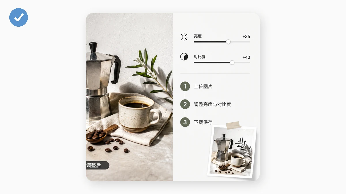
- Fix exposure with brightness. Nudge it until the overall level looks right — not so far that the bright areas blow out to pure white or the shadows crush to pure black.
- Add depth with contrast. Bump it up until the image has some snap. Stop before the shadows turn into featureless black holes.
- Adjust saturation last. If the color now looks a little dull, lift saturation slightly. If it looks garish after the contrast bump, pull it back. A small move here is usually all it takes.
That order matters — set the overall level first, then the depth, then the color — because each step changes how the next one looks.
Live preview so you're not guessing
Every slider updates the image as you drag, so you can watch the photo improve and stop at the point that looks right rather than typing in numbers and hoping. If you overshoot, drag back. There's a set of one-click presets too — Vivid leans on contrast, Fade lifts the blacks, Clarity sharpens a dull shot — and you can start from one of those and then fine-tune with the sliders on top, which is often faster than building a correction from zero.
Full-resolution export, no watermark
When it looks right, export a JPG or PNG at the photo's real resolution. No watermark, no sign-up, no downscaled preview handed back to you — the download is the full-size corrected file. That's the difference from a lot of free online adjusters that either shrink your image or brand it before letting you save.
It never leaves your browser
The whole thing runs locally on a canvas. Your photo isn't uploaded to a server to be brightened — the adjustment happens on your own device, and the picture stays there. Load the page once and it works offline afterward, so you can fix a batch of photos with no connection.
What it won't do
Be clear on the boundary: brightness and contrast here are global, applied to the whole frame at once. If your problem is local — one dark corner, a bright window blowing out behind an otherwise well-lit subject, or highlights you want to pull down without touching the shadows — that needs selective adjustment or curves, which this tool doesn't have. For the common case, though — a photo that's uniformly too dark, too flat, or too washed-out — three sliders and a live preview fix it in seconds.