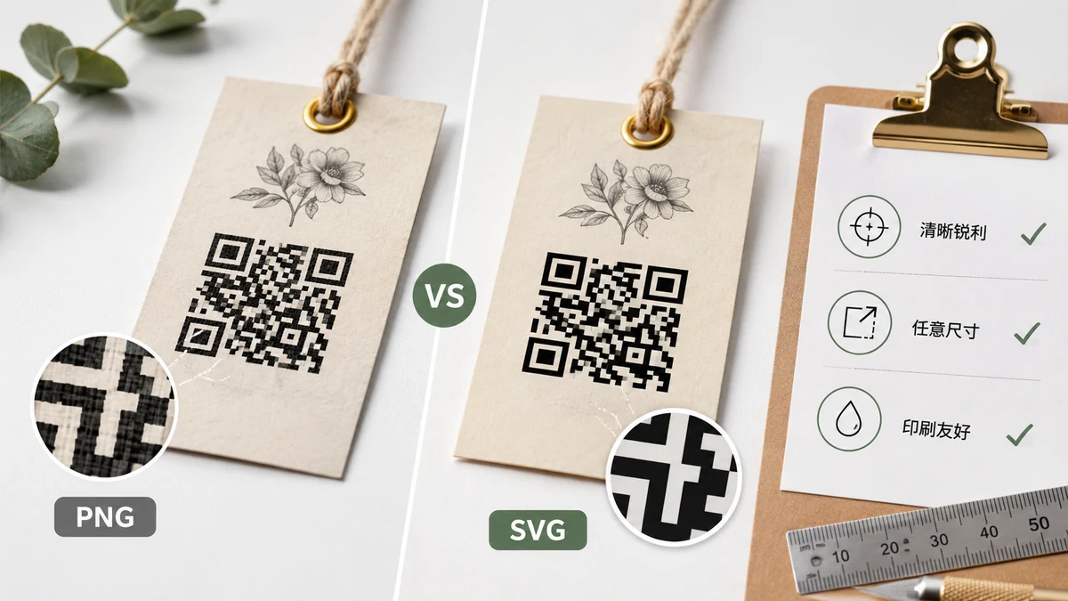
A QR code that scanned perfectly on your monitor can turn into an unreadable smudge on a printed flyer. The reasons are boring and fixable: wrong format, wrong size, too little margin, or colors that lose their contrast on paper. Here's how to get it right the first time.
PNG or SVG: it depends on where it lands
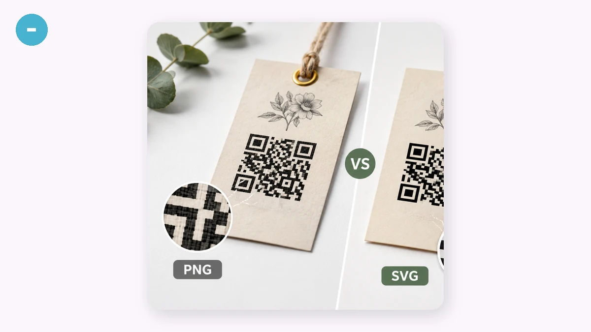
PNG is a grid of pixels. It's the right pick when the code lives on a screen — a website, a slide, an email — or a quick one-off print where you already know the final size. Export it big (1024 or 2048 px) so a print shop has pixels to work with. Blow a small PNG up past its resolution, though, and the sharp squares turn into fuzzy blocks with soft edges, and soft edges are exactly what makes a scanner hesitate.
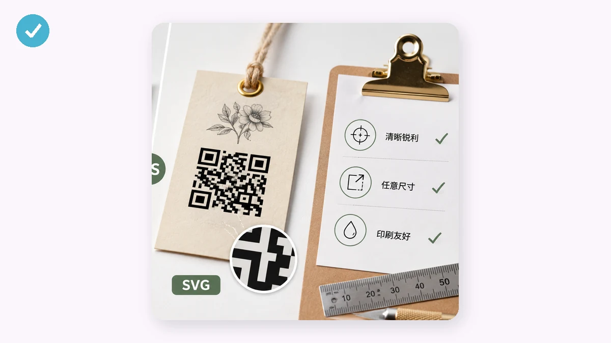
SVG is vector — the code is described as shapes, not pixels, so it stays perfectly crisp at any size. That's what you want for real print work: a poster, packaging, a business card, a roll-up banner. Hand the SVG to whoever does your layout (Illustrator, InDesign, Figma, Affinity all take it) and scale it freely without ever losing an edge. When in doubt for print, reach for SVG.
How big should it actually be?
The rough rule people use: the code should be about 1/10th of the scanning distance across. Scanned from 30 cm away (a phone reading a table card), roughly 3 cm is comfortable. On a poster read from 3 meters, you want something around 30 cm. Bigger is safer than smaller — a cramped code forces people to lean in and hunt for focus.
Two things make small codes worse: long data and high error correction. A URL with a long tracking tail, or level H correction, both pack more modules into the same square, shrinking each module. If your printed code has to stay small, keep the encoded text short and don't over-spend on error correction.
Don't starve the quiet zone
Every QR code needs a blank margin around it — the quiet zone. It's not decoration; it's the border that tells a scanner "the code stops here." The spec asks for about 4 modules of empty space on all sides. Designers cram codes right up against text or an image edge to save room, and scanning gets flaky. The generator lets you set the quiet-zone width — leave it generous, and don't let a background graphic bleed into that margin.
Error correction for print, briefly
Four levels — L (~7%), M (~15%), Q (~25%), H (~30%) — describe how much damage the code can take and still read. On paper that damage is real: ink smudges, folds, a coffee ring, a staple through a corner. For anything printed and handled, Q is a sensible default; go H if the code will be small, outdoors, or you plan to overlay a logo in the center yourself (H leaves enough redundancy for that). Screen-only? M is fine.
Contrast survives the trip to paper
On a bright screen a low-contrast code might just barely scan; printed under a shop's dim light it won't. Keep it dark on light — a genuinely dark foreground on a genuinely light background — and avoid inverting it (many readers reject a light-on-dark code). If you print on colored stock, make sure the background color you chose still leaves a strong gap from the foreground. Test the actual printout, not just the screen preview, before you order a thousand of them.
A quick pre-print checklist
- Export SVG for scaled print, high-res PNG for fixed-size or screen.
- Size it to roughly 1/10 of the expected scanning distance.
- Keep the quiet zone wide; don't let anything bleed into it.
- Use Q error correction for handled print, H for small or logo-overlaid codes.
- Dark foreground, light background, no inversion.
- Print one, scan it with two different phones, then order the batch.